Why your photos look bad (or good)? A composition tutorial on visual weight.
Why do certain photos seem more pleasing on the eye than others? It is a question that I am always asking myself. One of the illusive elements of photography is what makes something look good or indeed bad.
I have been looking for a simple formula for improving my photography for years and alas I have concluded that one doesn’t exist. However, there is something that plays a huge part in the appearance of a photo and that is visual balance.
To understand visual balance we first need to look at a few different terms. Namely symmetry, asymmetry, visual weight and visual direction. How can a photo have weight I hear you ask? read on…
Symmetry
A simple way of creating balance is using symmetry. It is obvious why the image balances and quickly the photo looks pleasing to the eye.
In this image there is obvious balance between the top and bottom of the image that is created between the horizontal line of symmetry. Similarly you can create balance through symmetry in a landscape orientation image with a vertical line of symmetry like the shot from Kirkjufell below.
Asymmetry
A less obvious but actually fairly intuitive way is to use asymmetry where the images aren’t symmetric but are still in balance. This can often look better in a photo as it is a more realistic approach to creating an image in most landscapes.
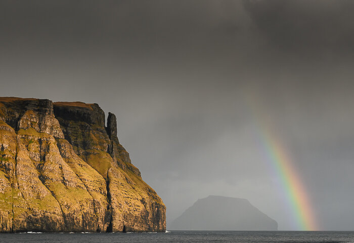
You probably don’t realise it most of the time but you will use asymmetric balance in your photos to make them look good. Here is a simple example of a photo with asymmetric balance.
In this photo there is no line of symmetry but the rainbow and the cliff balance each other out to create a visual pleasing image. Each item in the photo has the same or similar visual weight. So what is visual weight and how do you measure it?
Visual weight
First of all you can’t measure it and to determine the visual weight of something isn’t really a science. It is intuition but understanding some basic principles can help you get going in the right direction.
Think of visual weight as how much you are attracted to that element in the image. The more it attracts attention the more the visual weight of the object or area of the image.
Once you understand that every element on an image (object, space, person, tree, mountain, sky, colour, shadow, highlight) has a visual weight then it becomes easier to understand how to use this to guide the viewer and more importantly balance your image and improve your photography.
Let’s have a look at a few of the things that control visual weight. Here are the elements that I most often look at when composing an image.
Tonal value
The tonal value or brightness of a part of a photo is one of the more essential elements of visual weight. However, it is slightly counter intuitive and dark colours have a greater weighting than light colours.
The bottom hill with people on it in shadow has a strong visual weight as it has a low tonal value near black. It is balanced by a much larger lighter area at the top of the image.
Colour
In landscape photography colour plays a very important role in the balance of an image. You can easily see this when photographing a scene with a blue sky. The visual weight of the sky is large and often unbalances the scene. It is one reason that many photographers avoid shooting on blue sky days.
This image isn’t well balanced as the blue sky pulls your eye due to it’s visual weight being greater than the road below.
The red car in this image attracts your attention as red has a strong visual weight. However, the abundance of green helps to balance the image. The road also helps to connect the scene together.
Size and Position in the Frame
The apparent size of an object or element in a frame is really important in assessing it’s visual weight. But it isn’t quite as easy as just the size in the 2D space of the photo. Your mind is clever and it will give a small rock that is in the foreground of the image a larger visual weight that a larger rock further back in the image that is the same apparent size.
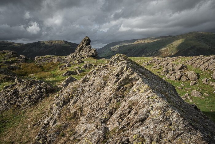
This rock in the foreground has a lot of visual weight as it is in the foreground and larger in size than the surrounding rocks. The dark sky starts to balance the image but there is a strong tension to this image.. However, sometimes having a slight imbalance can produce something special. What do you think about this image?
Texture
When shooing in low evening or morning light in landscape photography you often give objects more texture to portray the 3D shape in a 2D space. This then increases the visual weight of that element.
The balance of this image is helped by the low light on the path. This brings out the texture in the stone flags and combined with the strong pattern and powerful diagonal balances out the dark rock on the LHS of the image. Otherwise it will appear very unbalanced.
Shape Complexity
A small element with a more complex shape like a bike or person will have greater visual weight to something like a mountain.
Take this image of my looking out over the Langdale hills in the Lake District. There is no strong shapes apart from me and even though I am small the defined shape balances out the large sky and dark mountain. The corner area I am standing in helps to add to the balance as well.
There are many other things that impact on visual weight. Go and have a look at your photos and assign a visual weight to items and see if you can understand why the photos look great or not.
Although I tend not to use a lot of these things when I am composing an image as it is now more of an intuitive process over time I have found that using these to examine my images often helps me understand why they don’t work and improve next time. I feel that ultimately this becomes second nature. Do remember though that not every image needs to be balanced - sometimes you want to create tension in an image. However, I find that a balanced landscape photo tends to work better.
Let me know in the comments below what you think helps to balance an image and impact visual weight.
Good luck!


